Google Update: Mobile now part of rankings
By Matt Dowgwillo - Mar 20, 2015
I’m writing to make sure you know about this! Starting April 21st, 2015, Google will be adding “mobile friendliness” as a ranking criteria.
This means, that websites that are not mobile friendly will be penalized. Or in simple terms: If you’re not mobile, it will affect peoples’ ability to find you and your restaurant online because Google will drop you in rankings!
Mobile Statistics for Restaurants
As you should already know, over 60% of web searches for restaurants are done via phone.
Get your website mobile friendly, maintain search rankings
To maintain your search rankings, you’ll want to update your site! Here are some handy tips to do it… To see if you need to make the update, here is a GOOGLE TOOL that will show you what your site looks like via their mobile bots.
ThriftyHipster Option
2 years ago ThriftyHipster released its MOBILE SITE CMS for bars and restaurants… our goal was to make it easy for you to keep your website, mobile site, and social media all up-to-date, active, and current.
ThriftyHipster is offering a special offer, before April 21st (Google Deadline)
Features:
FREE Setup and Graphic Design
Simple to do! A 15 minute phone call and your web developer/hosting email and phone is all we need!
Just $2/day (makes you show up before competitors!)

Or, Design your own
Again, we’re doing this for customers for just $2/day, however, if you have the technical expertise and time, you can also make your own.
Here are 3 simple steps to help you when designing your website for mobile. Just remember to get it done before 4/21!
Step 1: Consider Use Case
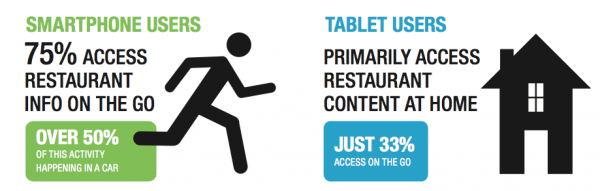
For restaurants, it’s important to consider HOW a user is searching, and WHEN they are searching, and most importantly, WHAT they are searching for when on their phones.
WHEN: Note the image above… 75% are on the “go”, 50% are in their cars!
WHAT: This question requires a bit more thought. If a user is searching for “Brits Pub” do you really think they care about “about”? Probably not. They are probably most interested in “Today’s Events” or operating hours, how to get there, or calling for a reservation.
If a user is driving in their cars, it’s important (and also safe) to make sure they get the information they are searching for, easily, and not make it a challenge to find. The thing with smartphones is, that they have essentially cut down the “advanced research” someone has to do; everything is now at their fingertips.
This makes sense, I mean, how many times have you ran out the door to meet someone, then looked in your calendar on the meeting place, then looked to Google Maps for directions?
Step 2: SIMPLIFY
For all the reasons in Step 1, you’ll want to make your mobile simple and easy to use. Note on Brit’s Mobile site below; we replaced a bunch of text and image buttons with simple, clean, big buttons to access the most important content.
Step 3: Make it Automatic
2 years ago, the few sites that offered a mobile website made you actually choose to “View Mobile Site” but in today’s world, that is completely unnecessary. Your browser should be able to detect and redirect. Show this link to your web developer; it has code to make it easy for you!
Above 3 steps should get you 95% of the way there, but if you really want to get in to it, just read Apple’s UI Guidelines>
Our Case Study
As you can see, we got rid of the fluff to give users simple, easy access to the information they are most interested in on the go. We redirect a user to this if we recognize the phone, and its all synced to simple content management.

In Conclusion…
Either share our tips for designing your own with your team, or we can get it done for you, but either way, you’ll want to avoid being penalized in Google and losing customers.
For additional help or questions, Email Matt [AT ] Thrifty Hipster DOT com or call us at 612-803-1022